Opinion on features under construction
-
I'm opening this topic because several managers approached me that they would like to give their opinion on new features before they were released. A great idea if you ask me. We're always looking to get more input on our 'thinking phase'. After all, we're making these features for you!
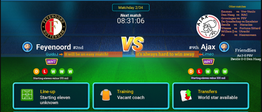
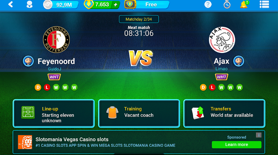
We're currently working on a new Home screen. The goal is that
- The information is in one overview (instead of scrollable)
- Most important information for your next match is available
- Before the home screen, you will see the screen that shows your result of the last match
All the features that aren't on the Home screen anymore will be added to the side menu. If you have an adfree account, Friendlies will be shown in that block.
Let us know what you think!
-
I'm opening this topic because several managers approached me that they would like to give their opinion on new features before they were released. A great idea if you ask me. We're always looking to get more input on our 'thinking phase'. After all, we're making these features for you!
We're currently working on a new Home screen. The goal is that
- The information is in one overview (instead of scrollable)
- Most important information for your next match is available
- Before the home screen, you will see the screen that shows your result of the last match
All the features that aren't on the Home screen anymore will be added to the side menu. If you have an adfree account, Friendlies will be shown in that block.
Let us know what you think!
@harry-poon Very good! Only for iOs? or even Android?
-
@harry-poon Very good! Only for iOs? or even Android?
@simone-antonello said in Opinion on features under construction:
@harry-poon Very good! Only for iOs? or even Android?
All platforms!
-
@simone-antonello said in Opinion on features under construction:
@harry-poon Very good! Only for iOs? or even Android?
All platforms!
@harry-poon its a excelent idea!.
Please put in android the initial formation before the simulation same at IOS.
-
Nice idea

Also a good feature would be if the best line up of the week would be showed in the newspaper as 4-4-2 and not just written there, would be simplier and better looking. -
I'm opening this topic because several managers approached me that they would like to give their opinion on new features before they were released. A great idea if you ask me. We're always looking to get more input on our 'thinking phase'. After all, we're making these features for you!
We're currently working on a new Home screen. The goal is that
- The information is in one overview (instead of scrollable)
- Most important information for your next match is available
- Before the home screen, you will see the screen that shows your result of the last match
All the features that aren't on the Home screen anymore will be added to the side menu. If you have an adfree account, Friendlies will be shown in that block.
Let us know what you think!
@harry-poon Good idea
-
Thanks all for the input! We're still working on this new Home screen.
-
@simone-antonello said in Opinion on features under construction:
@harry-poon Very good! Only for iOs? or even Android?
All platforms!
@harry-poon even the web version?
won't that be hard to use if your using web but on mobile? -
It is necessary to change the appearance we are accustomed to but over time we will adapt to this situation and know the details
-
Cant say that I like this. Unnecessary stuff take too much space and lots of impotant and easy accessible things like league table are missing now and I need aditional clicks to get them. Really dont see the point in this new home screen. It looks very nice, but It doesnt give enough information, and there are plenty of room for them.


🥉 OSM World Nations Cup 2021 - 3rd place (Croatia)
Crew: Proud to be Croat -
Oh man, and only now I noticed that we dont have the last result visible on our home page anymore.. Really missing that one, was always nice to see the last match you played up there. Please consider bringing at least that back.. really this "current match" takes too much unneccessary space....
🥉 OSM World Nations Cup 2021 - 3rd place (Croatia)
Crew: Proud to be Croat -
But thats no normal, that when I start OSM I see two big letters VS and 2 logos of clubs, that arent neither real and almost nothing else.
-
I got to respond negatively to this one. It doesn't look good, you can't find your results nor see them, it gives the impression that you are playing from a smartphone on a big screen of a PC.
-
The update is not bad but the classification and the top scorer should also appear, that is, the match would make it smaller even though it looks good, and on the right the classification above all and below the top scorer. Because now it confuses to know where you are in the classification. Apart I think that the opinion of the management is also missing. In short, I would do the smallest match and also the other 3 sections and add the direction to the 3 sections, and on the right would rank above all and below the top 3 scorers.