Opinion on features under construction
-
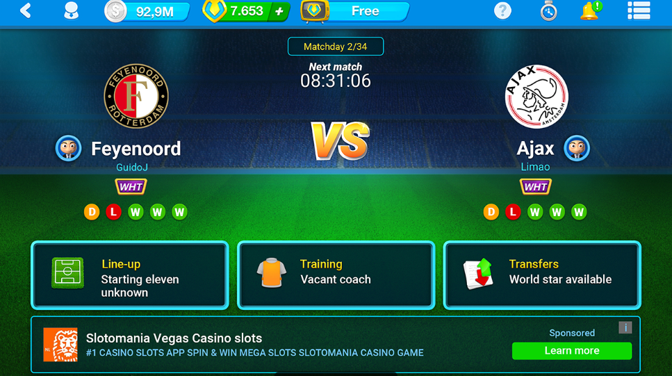
Something like the following image is that i think that could improve the new dashboard design... I made it fastly, just reduce a little the "next match" area and set on the right standing & next match!
Our focus stay in our next match but we have more useful information.
I want to know if someone is agree with that or anyway doesn't like it!")
-
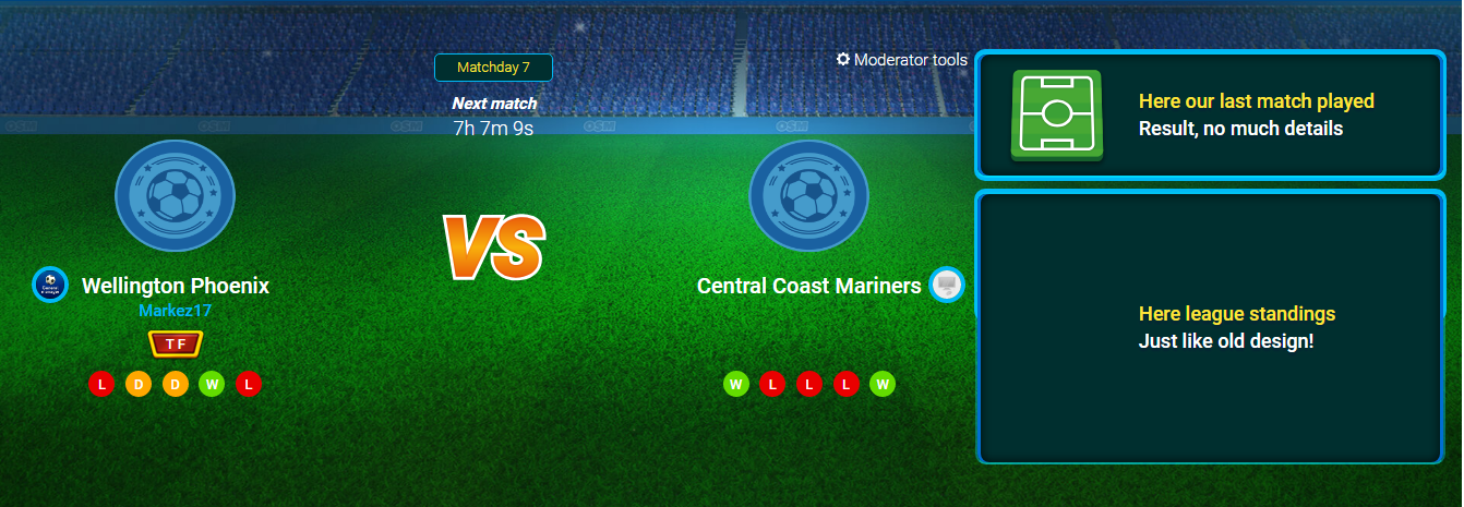
Something like the following image is that i think that could improve the new dashboard design... I made it fastly, just reduce a little the "next match" area and set on the right standing & next match!
Our focus stay in our next match but we have more useful information.
I want to know if someone is agree with that or anyway doesn't like it!@markez17 said in Opinion on features under construction:
Something like the following image is that i think that could improve the new dashboard design... I made it fastly, just reduce a little the "next match" area and set on the right standing & next match!
Our focus stay in our next match but we have more useful information.
I want to know if someone is agree with that or anyway doesn't like it!It is an improvement, but for the time being I would ask just to revert the homescreen until there is a good design for the new homescreen. It is pointless to put so much emphasis on the next match, whereas all the results from last game and even your own match are much more important to see on the homescreen. This just looks like a bad smartphone home screen implemented without any additions.
Please just revert it for the time being. -
@superpickle said in Opinion on features under construction:
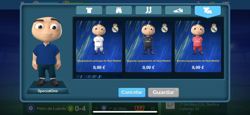
@harry-poon What is dressing your manager?
On iOS we already have this feature. You can dress your own manager with different shirts, suits, shorts, pants, shoes etc.
-
@superpickle said in Opinion on features under construction:
@harry-poon What is dressing your manager?
On iOS we already have this feature. You can dress your own manager with different shirts, suits, shorts, pants, shoes etc.
@harry-poon will it be implemented on android too?
-
@harry-poon will it be implemented on android too?
@manager-pr-9 said in Opinion on features under construction:
@harry-poon will it be implemented on android too?
The idea is to do this but not on short term.
-
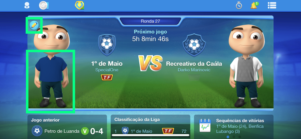
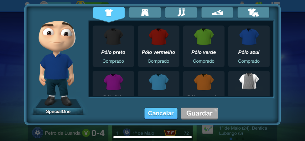
Some screens about 'Dressing your manager' feature:
"Success is not final, failure is not fatal: it is the courage to continue that counts." --Winston Churchill
-
Some screens about 'Dressing your manager' feature:
-
Some screens about 'Dressing your manager' feature:
@specialone and will be better to return back big pictures of users accounts... Not this empty logos...
-
@SpecialOne
And what about to return back old style home screen with score of ended match and statistics? Most of users in this topic asked to return it back. -
@majstor-matt said in Opinion on features under construction:
Sadly it looks like that add revenue is above customer service. I really dont see any other logic behinf this.

Increasing ad revenue actually wasn't a goal for this feature nor will it happen ;). The goal is to focus the screen on the next match (after all, that's what's most important) and make the overview more clear. Besides that, it was a technical clean up and also a preparation for (in long term) bringing in 'dressing your manager' to Android & Web.
@harry-poon I see. But yet again, "dressing your manager" is another way of increasing your income. Though its pointless for the quality of game. But I understand financial view of it.
Emphasis on next match is importan, but in order to focus on your next match you must be able to quickly see whats the league standings of your oponnent. If he is in battle for position with me of course I will be induced to use training camp and focus more on that match. On this new screen I cannot see anything like that, in order to learn about my oponnent I must click many time and nowadays people dont have time to do that, specially us who play on 4 slots.
Please, try to work on this, as this update is really once again not user friendly and I dont see how it improves our game. You must be able to have your last match result somewhere as you need to see in what kind of form your team is (Not just this WDL thingies), also league table must be visible somewhere on home screen, thats too much important infor not to be there... It helps even you financially as people are eager to use camps and secret trainings against people that are close to them in standings in order to catch them.. this way people who dont have time for that to check everything wont use as much camps and stuff.
I really hope you guys will work on this bit more, as this as it stands now is really really big downgrade... Even basic OFM back in 2010 or something had league standings up there on main screen...

🥉 OSM World Nations Cup 2021 - 3rd place (Croatia)
Crew: Proud to be Croat -
For me, new home screen is pointless wit this layout, it would much better if in every league all trams have logos, because most of the leagues dont have logos.
And league standing is more important than the following match, and if you manage to design it a bit better, both should stay on new home screen. Surface is huge and informations are low.New background picture looks nice, and i would like to be raplaced with back gorund colors on other game screen (rankings, tactics, line up...).
-
Posted by @Rasool-Khan
@rasool-khan said in New update not good!!:
The new update is not good enough, the homescreen doesn't show the league table, and other options. Please change this!! The previous homescreen was much better and efficient. Thank you!

"It's fine to celebrate success but it is more important to heed the lessons of failure." -- Bill Gates -
Can we have any sort of update about the current state of the homscreen? Will you revert the changes, or at least acknowledge that this update is terrible and it should be changed asap?
If you guys don't listen to our input, I think it is time for me to stop supporting the game financially and I'll be looking for an alternative game to play with my friends. -
@dagion_nl said in Opinion on features under construction:
Also is there a way to turn of the analysis part of the match played? Really don't care for it and it's like 20 clicks to skip through them with 4 teams.
Mate you can do this on the app if you click on your Avatar then click the settings icon (the round Icon that looks like a wheel) then click on match experience (the colour will change from blue to red). Match Experience will be deactivated!
"It's fine to celebrate success but it is more important to heed the lessons of failure." -- Bill Gates -
@harry-poon I see. But yet again, "dressing your manager" is another way of increasing your income. Though its pointless for the quality of game. But I understand financial view of it.
Emphasis on next match is importan, but in order to focus on your next match you must be able to quickly see whats the league standings of your oponnent. If he is in battle for position with me of course I will be induced to use training camp and focus more on that match. On this new screen I cannot see anything like that, in order to learn about my oponnent I must click many time and nowadays people dont have time to do that, specially us who play on 4 slots.
Please, try to work on this, as this update is really once again not user friendly and I dont see how it improves our game. You must be able to have your last match result somewhere as you need to see in what kind of form your team is (Not just this WDL thingies), also league table must be visible somewhere on home screen, thats too much important infor not to be there... It helps even you financially as people are eager to use camps and secret trainings against people that are close to them in standings in order to catch them.. this way people who dont have time for that to check everything wont use as much camps and stuff.
I really hope you guys will work on this bit more, as this as it stands now is really really big downgrade... Even basic OFM back in 2010 or something had league standings up there on main screen...
@majstor-matt said in Opinion on features under construction:
@harry-poon I see. But yet again, "dressing your manager" is another way of increasing your income. Though its pointless for the quality of game. But I understand financial view of it.
Emphasis on next match is importan, but in order to focus on your next match you must be able to quickly see whats the league standings of your oponnent. If he is in battle for position with me of course I will be induced to use training camp and focus more on that match. On this new screen I cannot see anything like that, in order to learn about my oponnent I must click many time and nowadays people dont have time to do that, specially us who play on 4 slots.
Please, try to work on this, as this update is really once again not user friendly and I dont see how it improves our game. You must be able to have your last match result somewhere as you need to see in what kind of form your team is (Not just this WDL thingies), also league table must be visible somewhere on home screen, thats too much important infor not to be there... It helps even you financially as people are eager to use camps and secret trainings against people that are close to them in standings in order to catch them.. this way people who dont have time for that to check everything wont use as much camps and stuff.
I really hope you guys will work on this bit more, as this as it stands now is really really big downgrade... Even basic OFM back in 2010 or something had league standings up there on main screen...
See your point. The most heard feedback is: we're missing the League Table. So that's definitely something we're going to bring up here. Hopefully I will soon have some news on if we're going to work on that.
-
Can we have any sort of update about the current state of the homscreen? Will you revert the changes, or at least acknowledge that this update is terrible and it should be changed asap?
If you guys don't listen to our input, I think it is time for me to stop supporting the game financially and I'll be looking for an alternative game to play with my friends.@nielsoonl said in Opinion on features under construction:
Can we have any sort of update about the current state of the homscreen? Will you revert the changes, or at least acknowledge that this update is terrible and it should be changed asap?
If you guys don't listen to our input, I think it is time for me to stop supporting the game financially and I'll be looking for an alternative game to play with my friends.We're getting lots of feedback on the new Home screen (positive and negative). Trying to adjust it according to this feedback is exactly why we posted it here. So hopefully I'll have some news soon on what and if we're going to work on this further.
-
@dagion_nl said in Opinion on features under construction:
Probably best to give the users a choice for their home screen. Personally really don't like this one, dislike it enough to complain. Previous sidebar and home screen were more efficient. Changes take time I get that but this home screen isn't giving the most important information (match played and standings).
For my playing style (4 teams with plug and play tactics and a lot of trading) the new sidebar and home screen are actually annoying. I only care for results, statistics of the previous match and league table, all of which you can't see or access easily.
Also is there a way to turn of the analysis part of the match played? Really don't care for it and it's like 20 clicks to skip through them with 4 teams.
Thanks for the feedback. You can disable the match experience in your Settings (Android) or app settings (iOS).
-
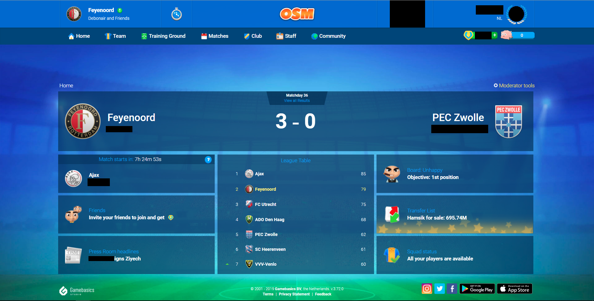
This is what the homescreen still should look like.
Friends, transferlist and board could be removed since those are not important. You could move squad status to the left and then it would leave you with a big area to put some fun statistics or whatever.
I made a new homescreen quickly. It could look something like this: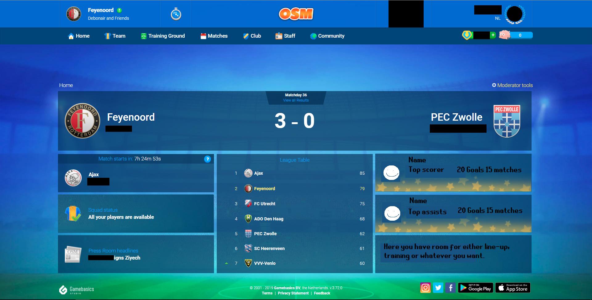
And if you guys really are that desperate to put in customizable trainer kits etc. You could do so by just a small guy next to each team. Or big on the left/right if you remove the whole right most section of top scorer, top assists etc.
But I really think you guys should focus more on what makes the game fun. That is NOT customizable trainers and more ways for you to get boss coins out of us. I really like seeing the league table, last results, the newspaper and fun statistics.
-
This is what the homescreen still should look like.
Friends, transferlist and board could be removed since those are not important. You could move squad status to the left and then it would leave you with a big area to put some fun statistics or whatever.
I made a new homescreen quickly. It could look something like this:And if you guys really are that desperate to put in customizable trainer kits etc. You could do so by just a small guy next to each team. Or big on the left/right if you remove the whole right most section of top scorer, top assists etc.
But I really think you guys should focus more on what makes the game fun. That is NOT customizable trainers and more ways for you to get boss coins out of us. I really like seeing the league table, last results, the newspaper and fun statistics.
@nielsoonl said in Opinion on features under construction:
This is what the homescreen still should look like.
Friends, transferlist and board could be removed since those are not important. You could move squad status to the left and then it would leave you with a big area to put some fun statistics or whatever.
I made a new homescreen quickly. It could look something like this:And if you guys really are that desperate to put in customizable trainer kits etc. You could do so by just a small guy next to each team. Or big on the left/right if you remove the whole right most section of top scorer, top assists etc.
But I really think you guys should focus more on what makes the game fun. That is NOT customizable trainers and more ways for you to get boss coins out of us. I really like seeing the league table, last results, the newspaper and fun statistics.
Thanks for the quick layout! We want to be consistent on all platforms (web and apps) and unfortunately all that info doesn't fit on those screens. I would like to add that the goal for customisable managers is NOT to make money. It already proved on iOS that it doesn't. We had some positive feedback on it and also some managers were asking for it in our surveys.
